Just home
Many people booking were recently discharged. They're adjusting to a care plan and new routines.
So: say what happens next, in order.
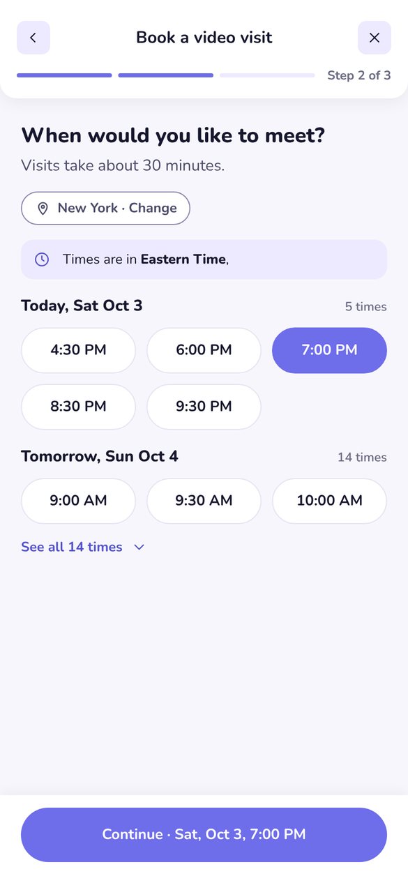
Clearer words, simpler and modern design, fewer dead ends, and a way to cancel that didn't exist before.
Read the storyA patient who just came home and needs a follow-up. They want a way to easily get in touch with doctors and get back to resting.
Many people booking were recently discharged. They're adjusting to a care plan and new routines.
So: say what happens next, in order.
Recovery is tiring. Every extra field, pop-up or unclear button costs more than it would on a good day.
So: ask less, and keep choices in view.
Something might be wrong. A cold error message or a confusing time can turn worry into a phone call.
So: be calm, plain and specific.
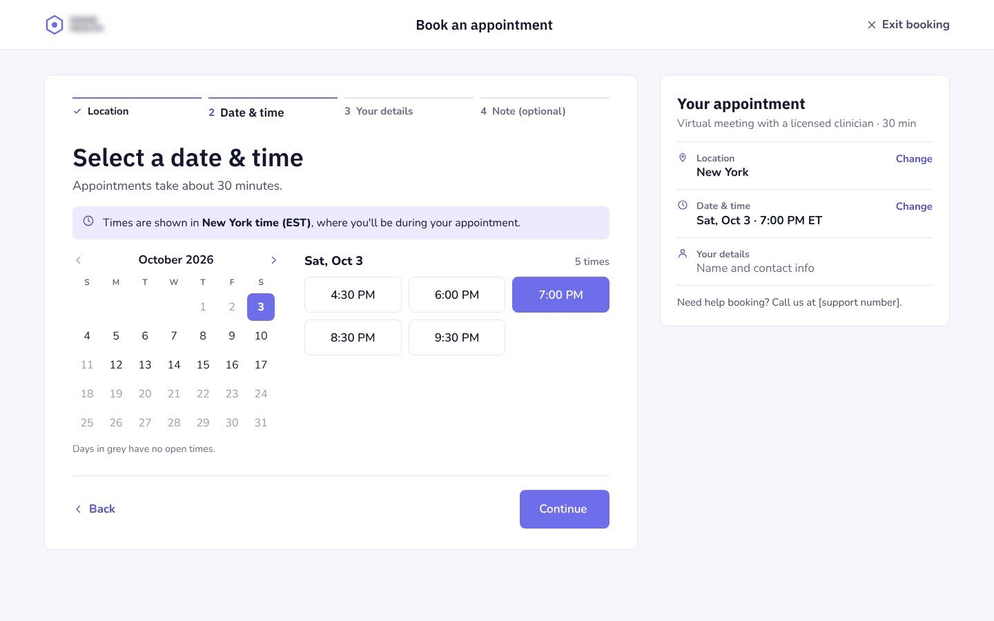
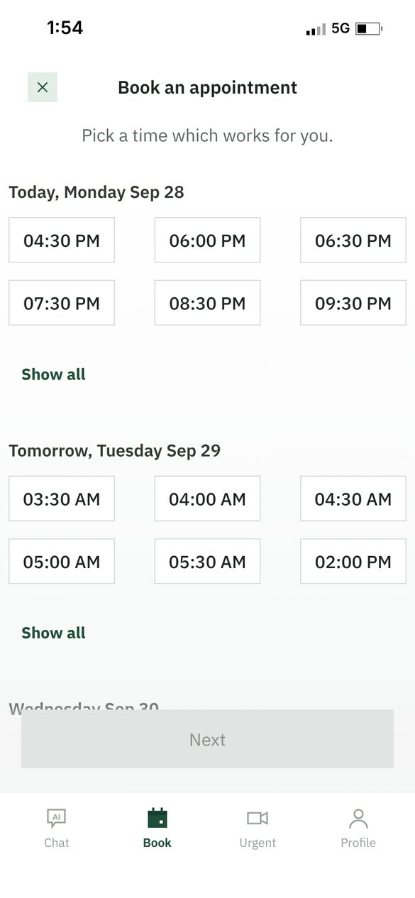
We went through the whole booking flow in the app and on the website, start to cancel. Each screen was checked for clarity, tone, accuracy and what happens when things go wrong. Here are the original screens, with the main problems marked.
Fixing screens one by one would have left the causes in place. Grouping the findings showed six habits that kept producing the same problems, so we fixed the habits.
Choices made in one step vanish in the next. By the note step, patients can't see the time they picked.
Clinical or bureaucratic words where a patient expects a person.
Sentences describe how the company works, not what the patient should do.
Errors blame the patient and don't say whether the appointment is safe.
Generic labels make people stop and reread the screen before they commit.
Times in the wrong zone, title case next to sentence case, and fields that shouldn't exist.
Drag, or use the arrow keys
The app already let patients cancel, but with one unclear option and no undo. The website had no way to cancel at all, so patients had to contact support.
A sample of lines from both platforms, before and after.
The six patterns became six rules for the whole product, so the next flow gets them right from the start.
Show what the patient has already chosen, and let them change it in place.
Plain, warm and short. Ask what they'd like to share, not for a diagnosis.
Give a reason when it helps someone decide. Leave out how the company works.
Say what happened, what's still safe, and what to do next. Never blame the patient.
"Book appointment", "Keep my visit", "Cancel visit". Sentence case, always.
Same term for the same thing everywhere, and times in the patient's state.
The app says "visit" and the website says "appointment", each one used consistently.
| Use | Instead of | Why |
|---|---|---|
| Clinician | Doctor, provider | Accurate, and it's who they'll see |
| Continue | Next | Steps move forward. The last one says "Book" |
| Eastern Time (New York time) | EDT, IDT, local time zone | Tied to where the patient will be |
| Check your phone | Phone Verification | Says what to do |
| Your note | Admission info, diagnosis | Patient language, not intake forms |
| This page didn't load | 404, you're lost | Owns the problem |
| Cancel visit | Yes | The button says what it does |
Every change ships with a clear metric, so each improvement can be proven before the next one is built.