KnowledgeUnique to each company
Client Playbook
Everything specific to the product: how it sounds, what things are called, and the decisions the team has already made.
An AI-powered UX content reviewer
We built Toast Box to help product teams review UX content (microcopy) before release. Like a senior UX writer, it analyzes full flows, flags content and usability issues, and recommends content and design changes where needed.
Read the story
In conversations with AI-native teams, we kept seeing the same pattern: product managers were using AI to generate new features, including much of the interface copy, and no one with UX writing or content strategy expertise reviewed it.
Prompts an AI tool with what the feature should do.
Every label, title, message and button comes out with the feature.
Checked for grammar issues, not with UX in mind.
With whatever the AI wrote, reviewed or not.
Whether content gets reviewed depends on time and availability.
Clear English doesn’t guarantee clear product guidance.
Teams lacked a reliable way to judge or maintain UX content quality across the product.
The opportunity was to bring specialized content design judgment into that workflow, without slowing anyone down.
We designed Toast Box around three layers: what's unique to each company, the UX writing judgment we bring to every client, and guided reviews that put both to work on real screens.
Everything specific to the product: how it sounds, what things are called, and the decisions the team has already made.
The content design expertise we bring to every project: what good UX content does, how to spot what gets in people's way, and when to ask instead of assuming.
Guided reviews for everyday product work, from a full flow to a single error message.
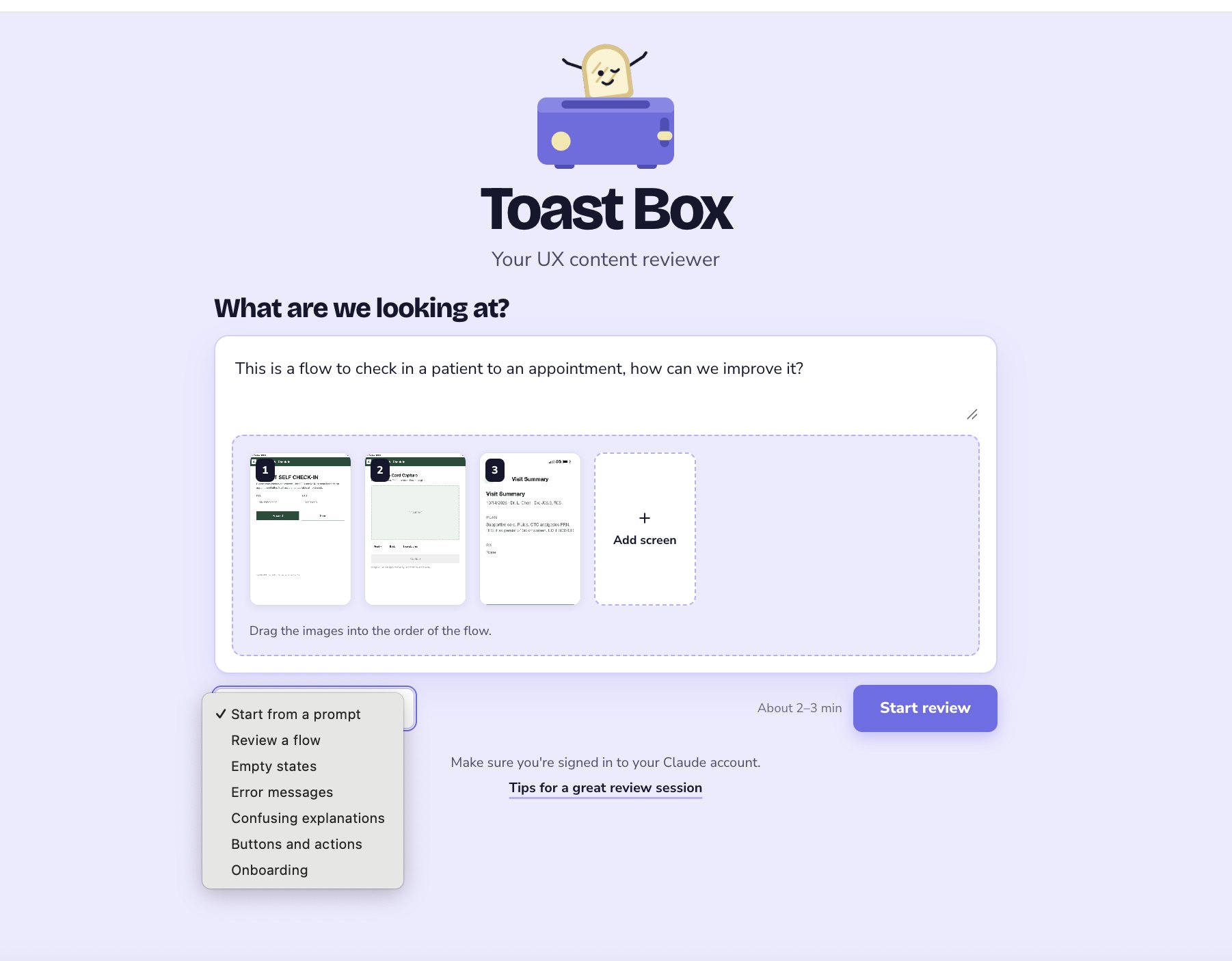
To get started, the user describes the flow in a prompt or selects one of the prepared workflows from the dropdown, then uploads the screens and drags them into the correct order.
Toast Box reviews the whole flow and opens with a summary, key findings and how severe each issue is.
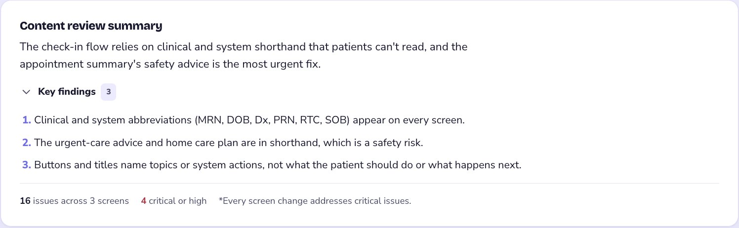
In this sample review, Toast Box found 16 issues across 3 screens, 4 of them critical or high. These figures describe the example flow, not product results.
When a recommendation depends on product knowledge it doesn't have, Toast Box asks the team. Each answer updates the versions with more relevant, context-aware content.
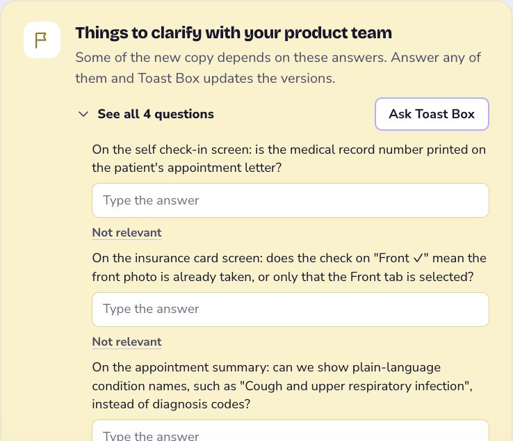
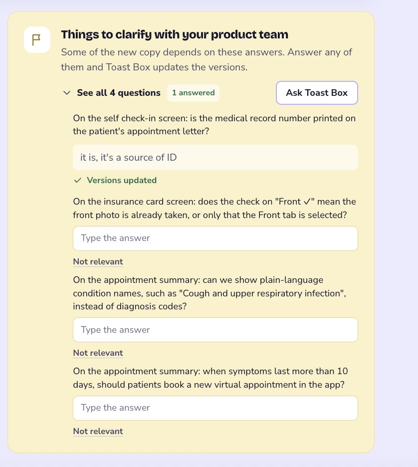
On the self check-in screen: is the medical record number printed on the patient's appointment letter?
it is, it's a source of ID
"Enter your date of birth and the record number on your appointment letter, or scan its barcode."
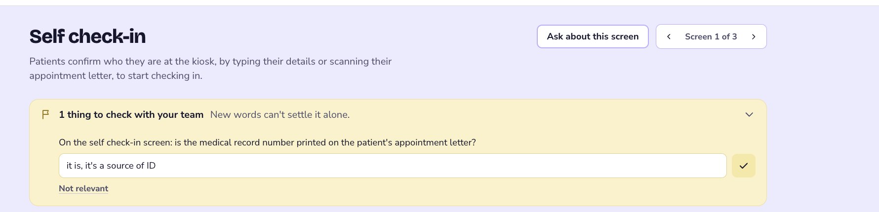
Each screen gets rewritten versions in the real interface, with every change explained. Toast Box recommends one; the team can compare the others or edit the text.
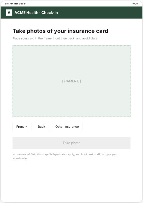
What changed: This version tells patients in plain words to take photos of their card and shows clearly how to skip if they have no insurance.
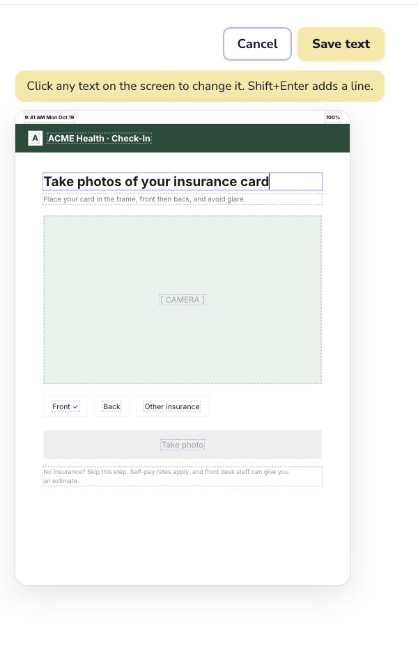
Click any line on the screen to change it. Toast Box makes a recommendation; it doesn't make the decision.
When words alone can't make a screen as clear as it could be, Toast Box says so and can offer a version with design changes.
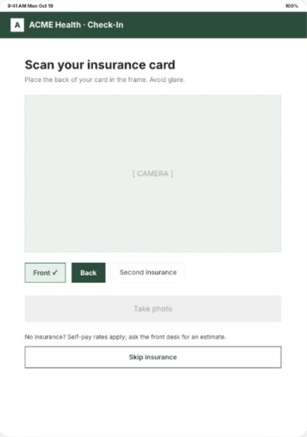
What changed: This version adds a clear "Skip insurance" button for patients without insurance and shows the front as done and the back as the current step, so patients know where they are and how to move on.
Once every screen has a version, the team sees the whole updated flow with changes highlighted. From there, the changes go straight back into their design work, as an AI prompt or as new screens.
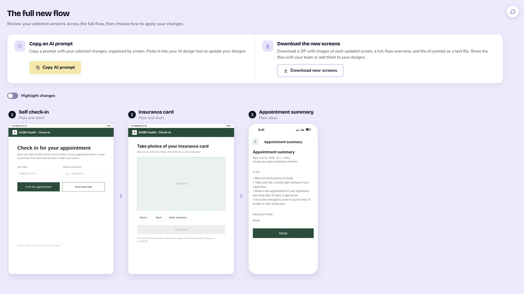
Every selected change, organized screen by screen, ready for the team's design tool.
The hardest design problem was getting Toast Box to make the kind of thoughtful, relevant recommendations we'd make ourselves. So we designed a feedback experience for our own team, and treated refining the reviewer as part of designing the product.
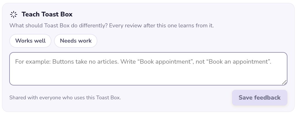
Every version in a review has a place to say what works and what needs work. Each note is shared with everyone who uses that Toast Box, and every review after it learns from it.